
Visualization
Between Abstract Data Patterns and Visible Cultural Artifacts
Visualization is a central method in the digital humanities for revealing patterns, trends, and relationships in data. It translates information into graphical forms, thereby enabling an analytical view of large cultural collections that would be difficult to access through text or tables alone.
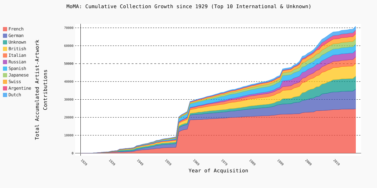
A distinction can be made between classical visualization and direct visualization, as defined by Lev Manovich. Classical visualizations often abstract data into points, lines, bars, or areas. One example is the MoMA visualization, which uses a cumulative stacked line graph to show how the number of works in the collection, broken down by nationality, has evolved over time. The individual artworks take a back seat to aggregated categories, thereby revealing broader historical trends and shifts in collection policy.
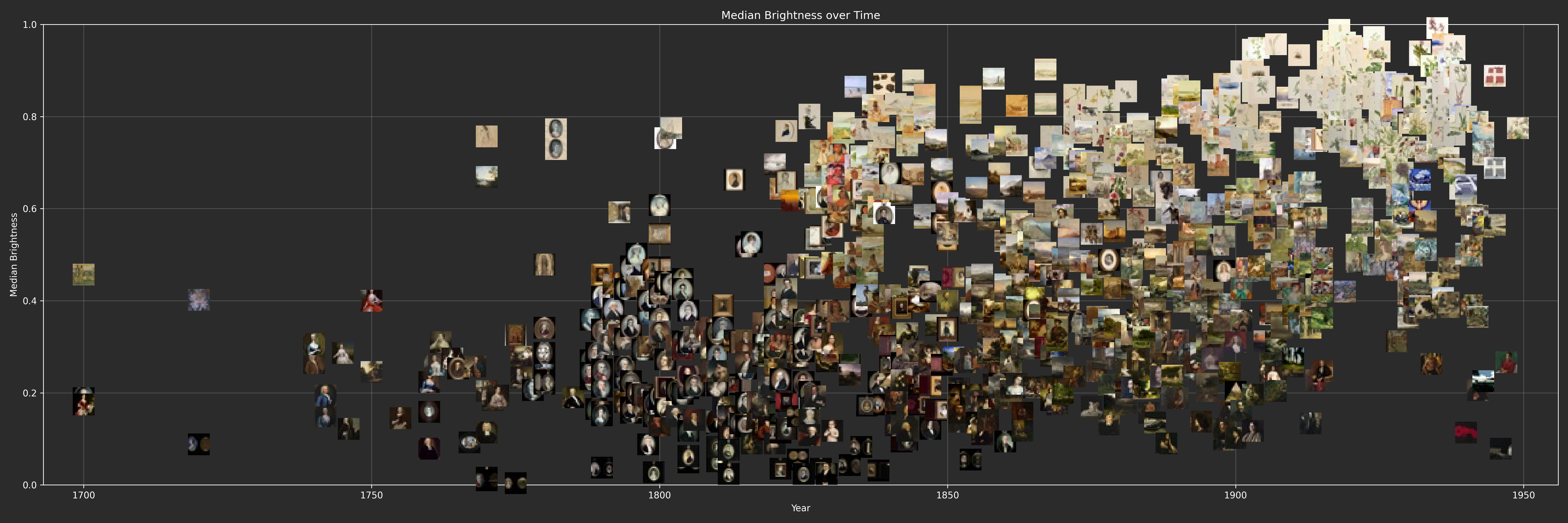
Direct visualization, on the other hand, takes a different approach: it does not completely replace cultural objects with abstract symbols, but rather incorporates them directly into the representation. In the visualization of the Smithsonian’s modern art collection, the works are plotted on a graph based on their median brightness relative to their creation date. Instead of simple data points, 16×16-pixel thumbnails of the artworks are used. This allows the objects to remain visible as images while simultaneously making their color characteristics comparable. Thus, one can see how the art landscape has changed over the period from 1750 to the present—not only through their position on the coordinate system but also directly within the images. For example, it is easy to see that oil portraits lost popularity over the course of the 19th century.
MoMA
"Working with what you have"
- 1. Data Source: An existing CSV dump of the MoMA collection metadata served as the starting point. The file contained structured information about the works, including dates, artist details, and nationalities.
- 2. Data Cleaning: The metadata was imported using Python, standardized, and reduced to relevant columns. Missing or ambiguous nationality information was not removed but was highlighted as a separate category.
- 3. Categorization: The most frequently represented nationalities were selected for visualization. In addition, a category for unknown information was included to ensure that gaps in the dataset remained visible.
- 4. Aggregation: The works were grouped by year and nationality. The values were then summed cumulatively to show how the composition of the collection has evolved over time.
- 5. Visualization: The aggregated data was presented as a cumulative stacked line graph. This allows long-term trends, dominant categories, and changes in the collection’s history to be identified at a glance.
- 6. Reflection: The visualization reveals historical patterns but remains bound to the categories of the dataset. Nationality is not a neutral characteristic here, but rather a simplifying and, in some cases, uncertain classification.
Smithsonian
"Getting what you need"
- 1. Data Source: No directly usable image dataset was available for the Smithsonian visualization. Therefore, the relevant object information first had to be extracted from the online collection.
- 2. Metadata scraping: The available artwork data was automatically collected from the collection pages. Among other things, titles, dates, object IDs, and image references were extracted.
- 3. Image download via crawler: Based on the collected image references, the corresponding artwork images were downloaded using a crawler. This created a local image dataset that could then be analyzed.
- 4. Image processing: The images were processed automatically and analyzed for comparable visual characteristics. For each artwork, the median brightness and median saturation were calculated.
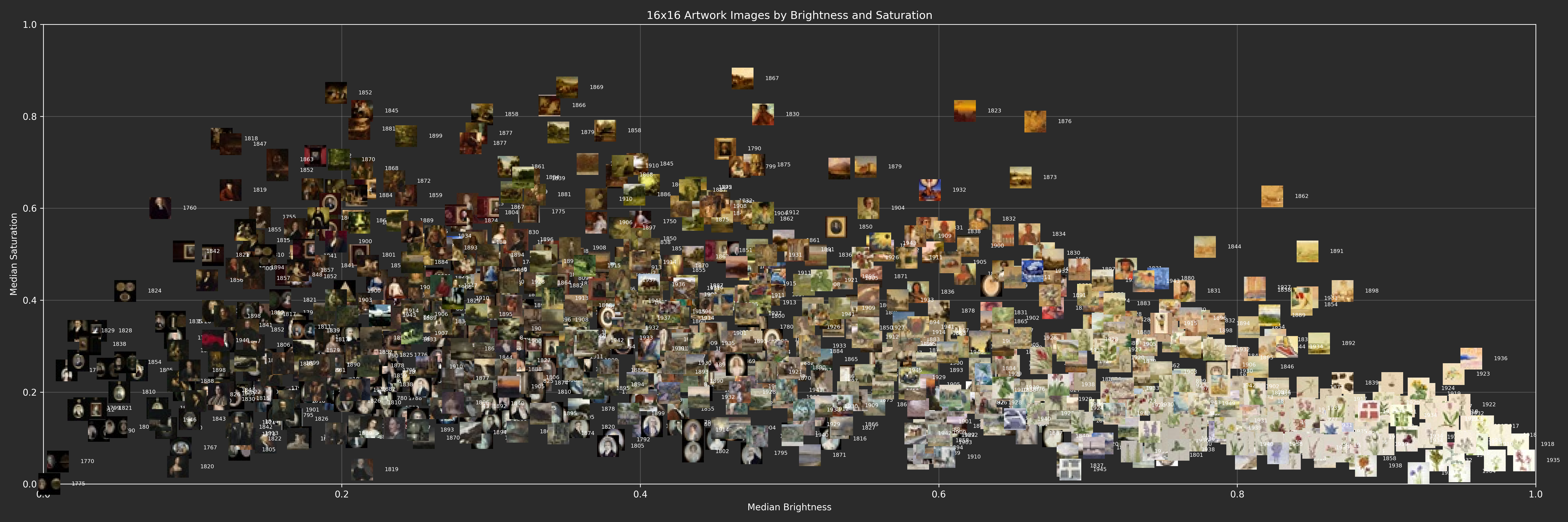
- 5. Modeling: Each artwork was assigned a position in a coordinate system: the x-axis represents the median brightness, and the y-axis represents the median saturation. This allows for the comparison of color similarities and differences between the works.
- 6. Direct Visualization: Instead of abstract points, 16×16-pixel thumbnails of the artworks were included in the plot. This allows the works themselves to remain visible while also being interpretable as data points.
- 7. Reflection: The visualization depends on image quality, digitization, color profiles, and the reduction of complex artworks to a few measured values. Precisely because of this, it reveals not only patterns but also the uncertainties inherent in digital humanities data.